By Nick Bond
Mean temperatures are often used to characterize the climate on time scales of weeks to millennia, but they are not the whole story. Belaboring the obvious, the variations in temperature also matter. There are a variety of ways to display temperature distributions, with violin plots gaining some popularity because they can add more information than a traditional box-and-whisker plot within a similar amount of plotting space. The objective of this piece is to illustrate how violin plots can be used to compare maximum and minimum temperature distributions in different parts of WA state, considering winter and summer separately. There are a variety of resources online that delve into the characteristics of violin plots; here is an example featuring air temperatures in Mexico City.
For present purposes we consider daily maximum and minimum temperatures from 1991 through August 2021 for Quillayute, Sea-Tac Airport (Seattle), Spokane Airport and the Pasco Tri- Cities. We focus on the present climate recognizing the statistics of daily temperatures in WA are not stationary. Violin plots may be an effective way to visualize climate change impacts on temperature variability in WA, but that is beyond our scope here.
Violin plots for temperatures during the winter months of December through February and the summer months of June through August are shown in Figures 1 and 2, respectively. Median temperatures are indicated with the white dots, and traditional box-and-whisker representations of the data by quartile are also included. The curve that makes the violin shape is essentially just a histogram of the entire temperature distribution on its side and mirrored.
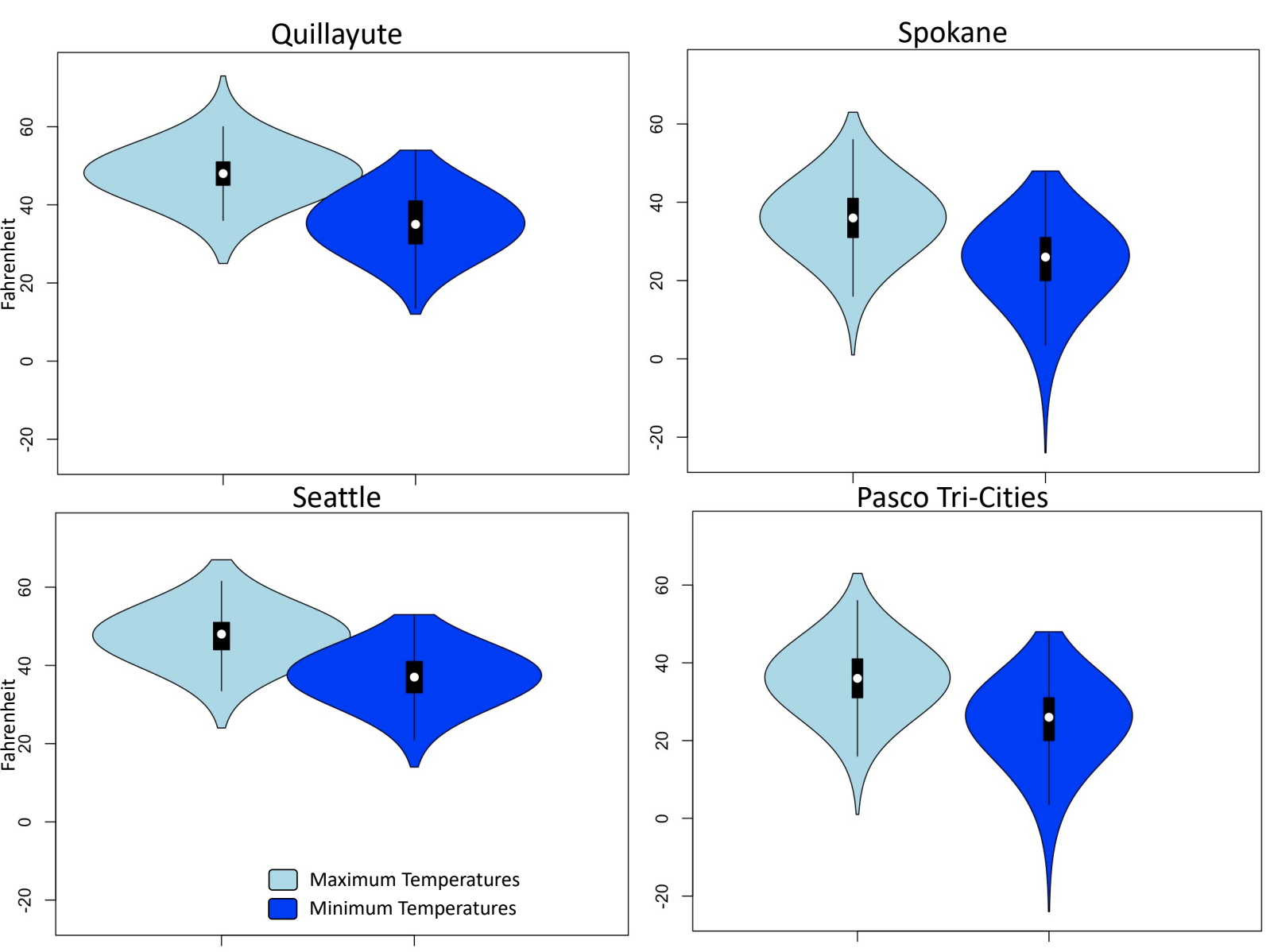 Figure 1:Violin plots of 1991-2021 December-January-February (winter) maximum (light blue) and minimum (dark blue) temperatures at Quillayute, Seattle, Spokane, and Pasco Tri-Cities.
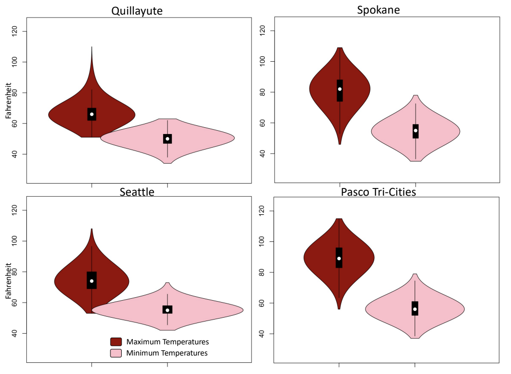 Figure 2: Violin plots of 1991-2021 June-July-August (summer) maximum (dark red) and minimum (pink) temperatures at Quillayute, Seattle, Spokane, and Pasco Tri-Cities.
In our examples, the violin plots for winter clearly show that the ranges of temperatures for the west side stations are much less than their counterparts for the east side. The west side also does not often experience extremes of either sense in both maximum and minimum temperatures. In contrast, Spokane and the Tri-Cities are more likely to have extreme cold temperatures, particularly in their minimum temperatures, as illustrated by the long tails of the violins.
The violin plots for summer have some similarities and some differences with those in winter. Quillayute and Seattle have long tails on the high side with respect to maximum temperatures, recall the record setting temperatures of late June 2021 are included in the mix. They also exhibit relatively small ranges in minimum temperatures. The coldest maximum temperatures are essentially the median minimum
temperatures at each station. Presumably this occurs on those “June gloom” days with persistent stratus cloud decks that prevent much solar heating. On the other hand, Spokane and the Tri- Cities have somewhat longer tails on the low end in their maximum temperatures, and greater overall spreads between their maximum and minimum temperatures.
Violin plots seem well-suited for a host of meteorological plotting applications. Readers interested in producing some for themselves may want to check out the plotting tool on a web site maintained by Iowa State University (the Cyclones! – a mascot our readers should appreciate). It has a database that includes a number of long-term stations in Washington state. Another useful way of displaying temperature data is through ridgeline plots, which are particularly well-suited for visualizing changes in distributions in time. Perhaps in a future newsletter we will use that technique to examine how temperatures have varied over the years in our neck of the woods.